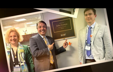
By: Ashley Mulaik, MBA, and Bri Driggers
In 2020, over half of the working physicians in the United States worked for private practices. These practices are wholly owned by physicians rather than hospitals, health systems, or other third parties.
There are several reasons why physicians might choose private practice over a larger healthcare system, particularly the chance for more autonomy and less bureaucracy. Partners at a practice work together to make decisions about processes and services democratically based on what they think is best for their patients rather than being told what to do by a higher-up.
Physicians who work for a healthcare system or hospital fulfill more of an employee role, as they are not the primary decision-makers and typically do not have ownership of the entity. However, physicians in private practice have a vested personal and financial interest in the company’s success, whether they own a solo practice or are part of a group practice. The main downside of working in a private practice is that they often don’t have access to the same resources that larger organizations do. This can impact the efficiency and profitability of the practice or cause physicians to work overtime to compensate for the lack of administrative staff.
This is where having access to various billing and operations dashboards can be a game changer in optimizing a practice in their operations and revenue.
The world of data analytics has experienced substantial growth in innovation and utilization within the healthcare industry over the past decade. Some Electronic Health Record (EHR) systems include dashboards and analytical tools, but those resources typically only scratch the surface of reporting possibilities. Discover how well your EHR system is performing with our Electronic Health Record Audit. Instead of viewing totals of data to identify top trends, what if you were able to drill down further to discover the “what, why, and how” behind the numbers?
Every provider group has different specific needs for data analytics, but there are three main dashboard topics that should be implemented within every practice. Once the basics of these three topics are understood, additional dashboards can be created and customized to specifically fit the requirements of any organization’s needs.
The Top 3 Healthcare Dashboards You Need in Your Provider Group
Between billing systems, patient management platforms, and various other software applications utilized within healthcare, there is a large quantity of data to analyze and a seemingly endless number of dashboards and reports to create. Step one is identifying what primary opportunities exist within your organization. From there, data sources can be identified, and dashboards can be built to monitor specific metrics and assist in critical decision-making for practice optimization.
Denial Management
In a perfect world, a claim would be submitted by a medical group with complete and appropriate information, and the insurance company would accept the claim and pay it. Unfortunately, the process of receiving payments from insurance is not that straightforward. There are many reasons that a claim can be denied by a payer. Find out why your claims are getting denied and what to do about it.
Denial categories are sourced from each area of the revenue cycle. They can initiate as early as patient registration or as late as claim submission. Even if a practice follows a best practice process for revenue cycle functions, there are hundreds of payers all with their own specific requirements for how different services must be processed. These requirements change so frequently that it is almost impossible to submit 100% of claims without an error here or there.

1 Denial Management Sample Dashboard
There is a substantial amount of time between providing a service and being reimbursed for that encounter. If the insurance company denies the claim—meaning they will not reimburse your practice for the service provided based on the information you submitted—you could go even longer without receiving payment or, in the worst-case scenario, not receive any payment at all. If you are not actively tracking and analyzing your denials, you are probably losing revenue without even realizing it.
There are two types of denials, regardless of category: unavoidable and actionable. Unavoidable denials are a result of circumstances that the medical group could not have prevented. Actionable denials occur when a denial could have been prevented by the medical group. These are the most common between these two groups. The necessity of monitoring controllable potential revenue loss makes the primary argument for why your practice should have a denials management dashboard. If these actionable denials can be monitored and recurring opportunities can be identified, strategic decisions can be made to revise processes to prevent denials from occurring in the first place.
Many practices monitor denials by resolving claims based on denial amount. This does work for recovering high-dollar claims, but it is a reactive approach to denial management. By utilizing dashboards that show a complete breakdown of detail, practices can maneuver to a proactive approach to denial management.
Scheduling Optimization
There are many reasons to monitor scheduling metrics. This type of data can communicate which providers or equipment are being stretched thin with full schedules, or what revenue opportunities lie within scheduling. To keep it simple: The more patients your practice sees in a day, the more revenue your practice brings in. With this type of dashboard, you are not only identifying potential revenue growth opportunities, but you are also able to optimize areas that affect overall patient and staff satisfaction.
When incorporating a scheduling optimization dashboard into your routine analytics, there are a few metrics that are critical to include. The first measure is the average visit/procedure/treatment duration. Averages should be benchmarked against industry standards to see if your practice is maintaining an adequate duration for every patient encounter. Optimizing an appointment schedule is essential for seeing an adequate number of patients in a day to propel revenue growth. There are many factors that feed into how long a patient’s appointment lasts. The main reason for a visit, such as imaging or a Physician consult, is important, but it should not be the sole determinant of how far apart patients are scheduled. All activities that occur from the second the patient enters the waiting room to the second they check out and leave must be considered. If overall patient encounters are taking too long, this decreases the number of patients able to be seen in a day and ultimately shortens your gross profit margin as the costs incurred with staffing do not change.

2 Scheduling Optimization Sample Dashboard
The second metric that is essential to review is capacity. It’s beneficial to identify with average appointment durations how many patients could potentially be seen in a day, but to make changes with that information you must first consider if you have the proper resources and staffing to support additional capacity. It could appear that a practice has additional opportunities to schedule more appointments in a day due to the excess downtime between patients, but if staff is already maximized at capacity, there aren’t adequate resources to support an increase in volume. On the other hand, there could be no available downtime and additional capacity accessible, which leads to discussions about if there is too much staff or equipment.
The key is efficiency: seeing as many patients as you can while delivering the highest quality of care possible to each one. A scheduling optimization dashboard helps provide decision-makers with the information they need to make critical choices regarding patient volume, staffing, and resources. With the combination of information displaying available or lack of downtime with overall capacity, decision-makers can optimize their schedule to increase volume and revenue.
Provider Productivity
The most effective way to bring in more revenue is to ensure you get more high-quality work done daily. A provider productivity dashboard helps you visualize how each provider is performing against other providers as well as against benchmarks. This can help you determine whether your providers are being fairly compensated for their work and identify providers who might need some extra support. Metrics available on this type of dashboard can also communicate a provider’s strengths in what type of procedures they perform the most.
When considering a provider productivity dashboard, it is important to select the appropriate data to visualize. While charges and payments may be attractive numbers to see, that is not the most effective way to review productivity. There could be two providers that put in the same amount of work on two different types of procedures, but the charge amount varies greatly based on reimbursement rates. This is why it is important to utilize Relative Value Units (RVUs) to measure performance. RVUs are the best way to mitigate inflations in data that are present in charges. They are also preferable over analyzing data by quantity of procedure since all procedures are different and require varying amounts of time and resources to complete.

3 Provider Productivity Sample Dashboard
Although charges aren’t the best way to understand provider productivity, that does not mean that charges by provider should not be included on your dashboard. Transaction data such as charges or collection rate by provider is useful, it just answers questions outside of how efficiently physicians are producing. RVU data can be compared to transaction data for a more thorough analysis. If a provider has a high RVU count, but their collection rate is lower, this may indicate a problem within the billing cycle that is painting a false picture of a provider’s generated revenue regardless of the work they are contributing.
Understand Your Data with RCCS
After years of working with practices of all sizes to improve the efficiency of charge capture and billing, we know that most EHRs don’t offer a dashboard with all the features you need to manage your practice effectively. That’s why we decided to build our own. Our new Client Service Delivery feature offers highly visual dashboards that analyze your most important data, provide monthly feedback, and help with revenue cycle optimization. We believe that every client is unique and has attributes that require customized dashboard reporting. That’s why no two dashboards are the same.